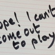
Ugly Fonts Help Proofreading: M J Hyland

via writing.ie
Here’s a great tip from M J Hyland, author of This is How and lecturer in creative writing at The University of Manchester. In a nutshell, she says:
Printing off your text in an ugly font will make mistakes show up more clearly.
The online magazine writing.ie expands on Hyland’s observation by quoting New Scientist’s explanation of how the brain reacts to different fonts.
Also according to M J Hyland:
When you’re actually writing, fonts can be a really useful visual way of distinguishing between different works or even sections of the same piece – sometimes if I’m moving between two projects (if I’ve just finished a first draft of something and am moving back to a previous project to edit, or if I’m taking a break from a novel to work on a short story) I put the two projects in different fonts so that as soon as I look at the screen I get a sense of which ‘voice’ I’m in.
I’m definitely going to take the advice on Ugly Fonts. Let me know if you’ve tried this before. Which is a good Ugly Font?
I realize I’m already doing as Hyland suggests with her second piece of advice. I’m currently redrafting a short story that I’m going to give away later this month. I’m writing this short story in Century Gothic instead of Times New Roman, which I used for drafting A Calculated Life. And the different font does put me in a different frame of mind.


Trackbacks & Pingbacks
[…] Ugly Fonts Help Proofreading: H J Hyland […]
Leave a Reply
Want to join the discussion?Feel free to contribute!